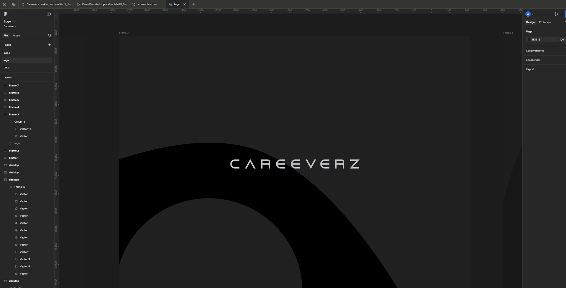
CareeVerz logo
Adventures in logo design
· by Aron Kovacs
We already had a lot of cool animations (e.g.: loading)
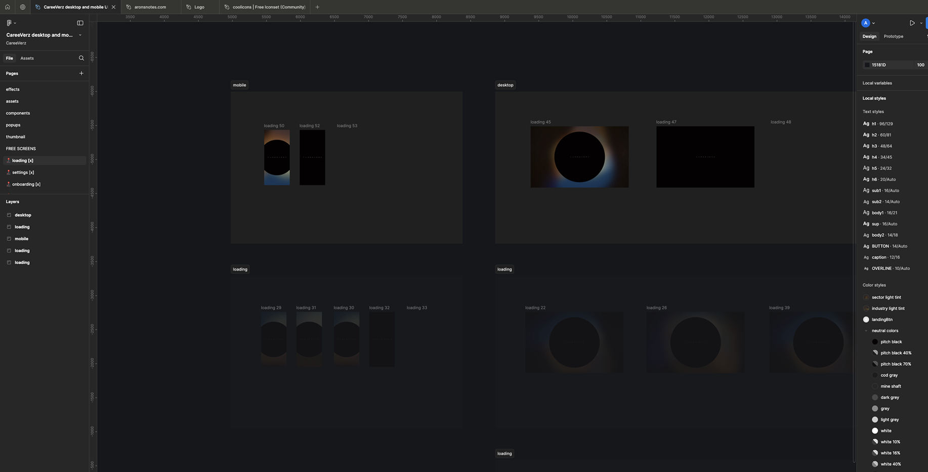
You can check one here
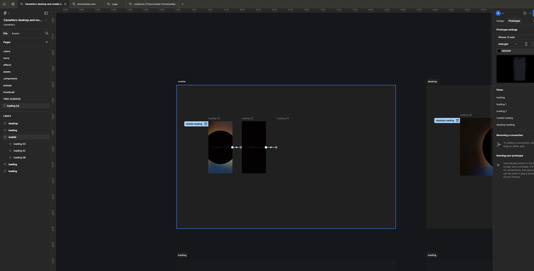
So I played with this...
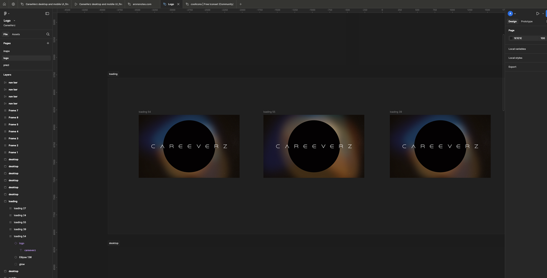
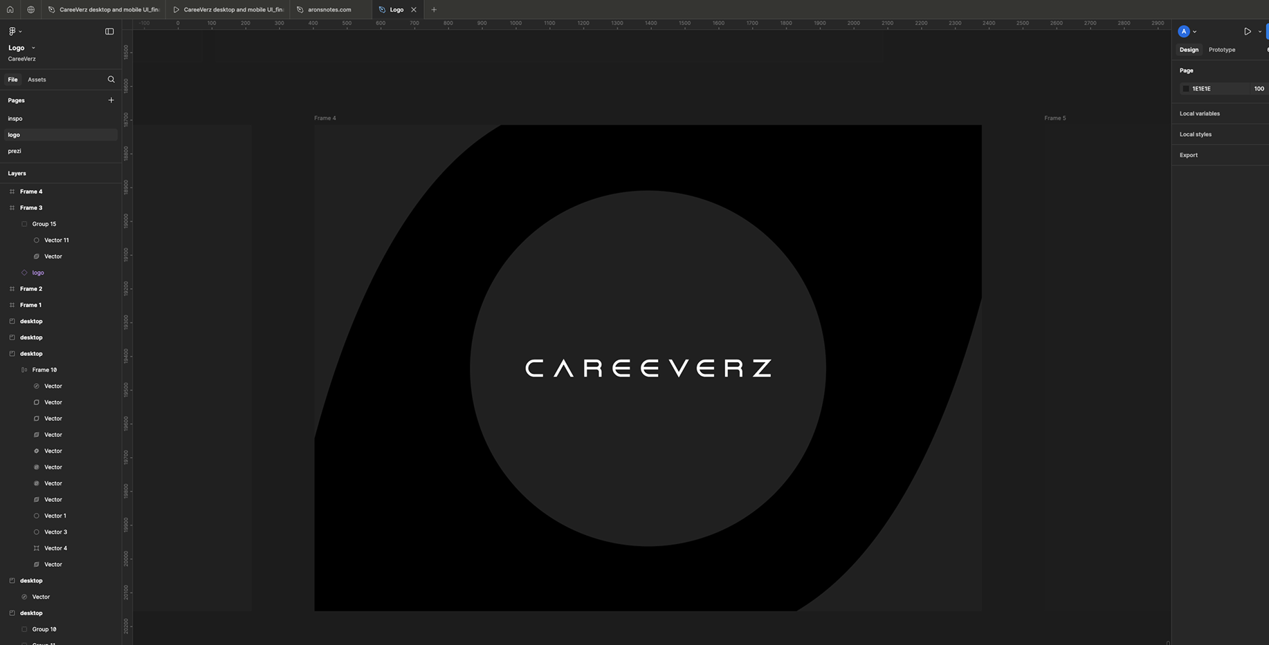
I converted it to standard square form...
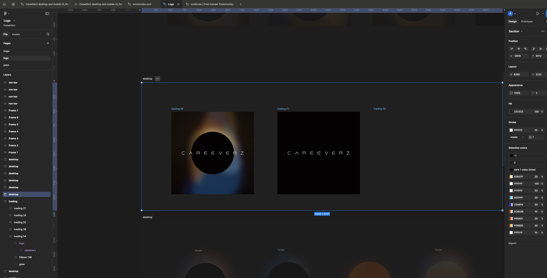
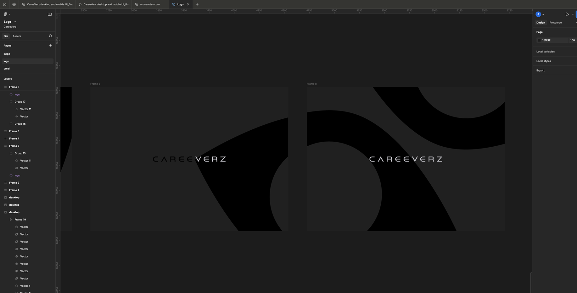
In addition to the black hole, I also played with the sun...
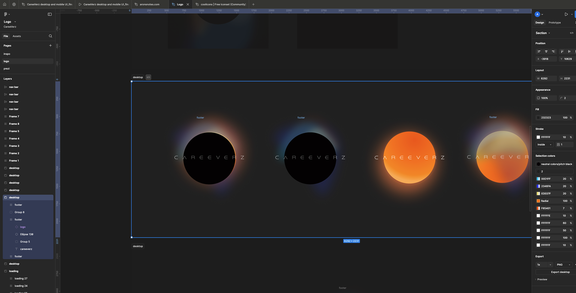
At this point I was satisfied! So I asked for feedback from a design expert... She also liked the first version called "eclipse" (black hole + sun) the best!! Only the font is too thin...
... which is a problem because there's no thicker font from Dune Rise...
But I figured with a trick i could make it thicker! I added contour to it... Ladies and gentlemen, low and behold our logo:
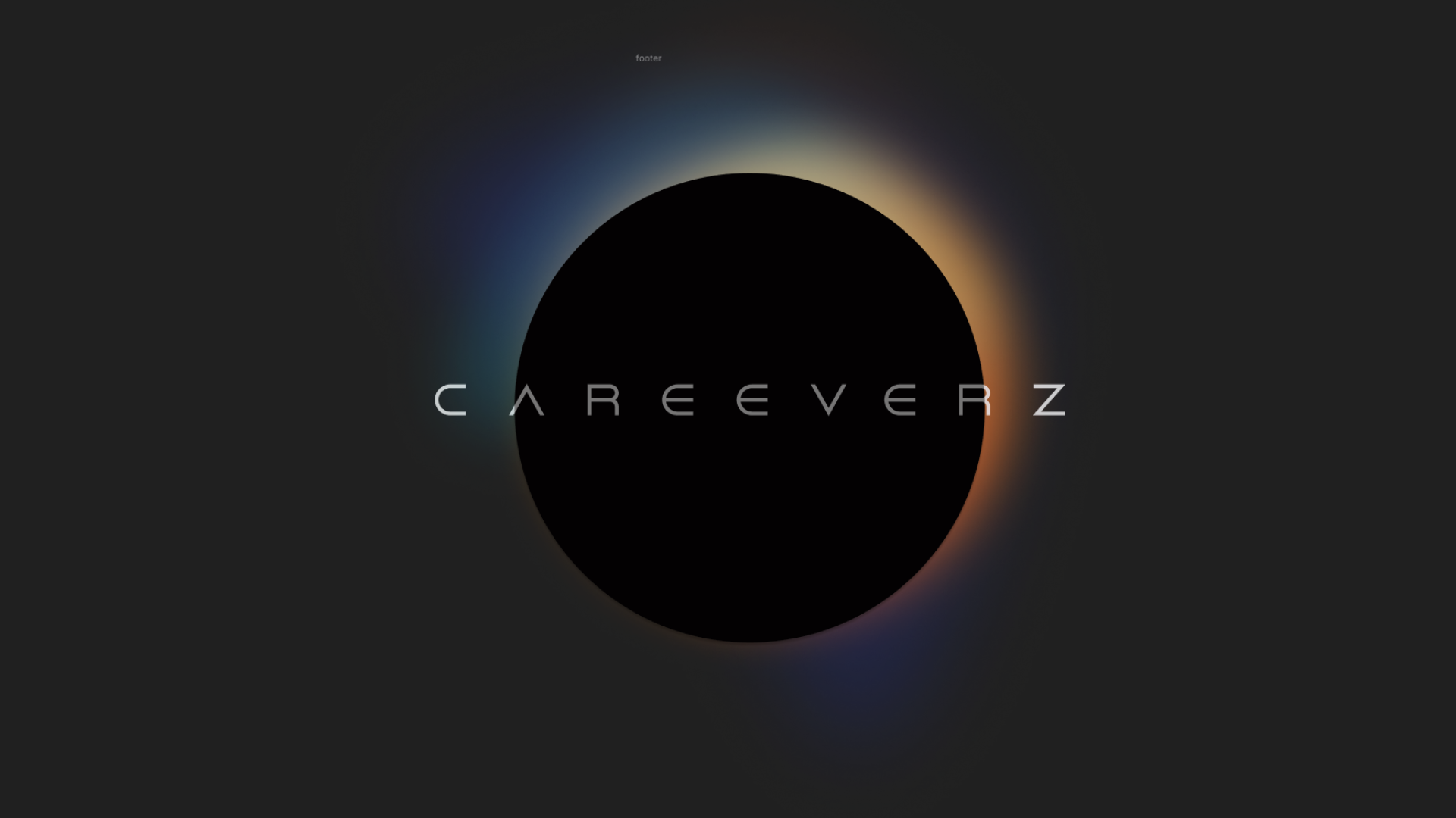
In the eclipse version:
- the sun is blurred in the background
- our font is bolded
- and layered so that the “sun can shine on it”
the end?
And now the same thing in 128KB
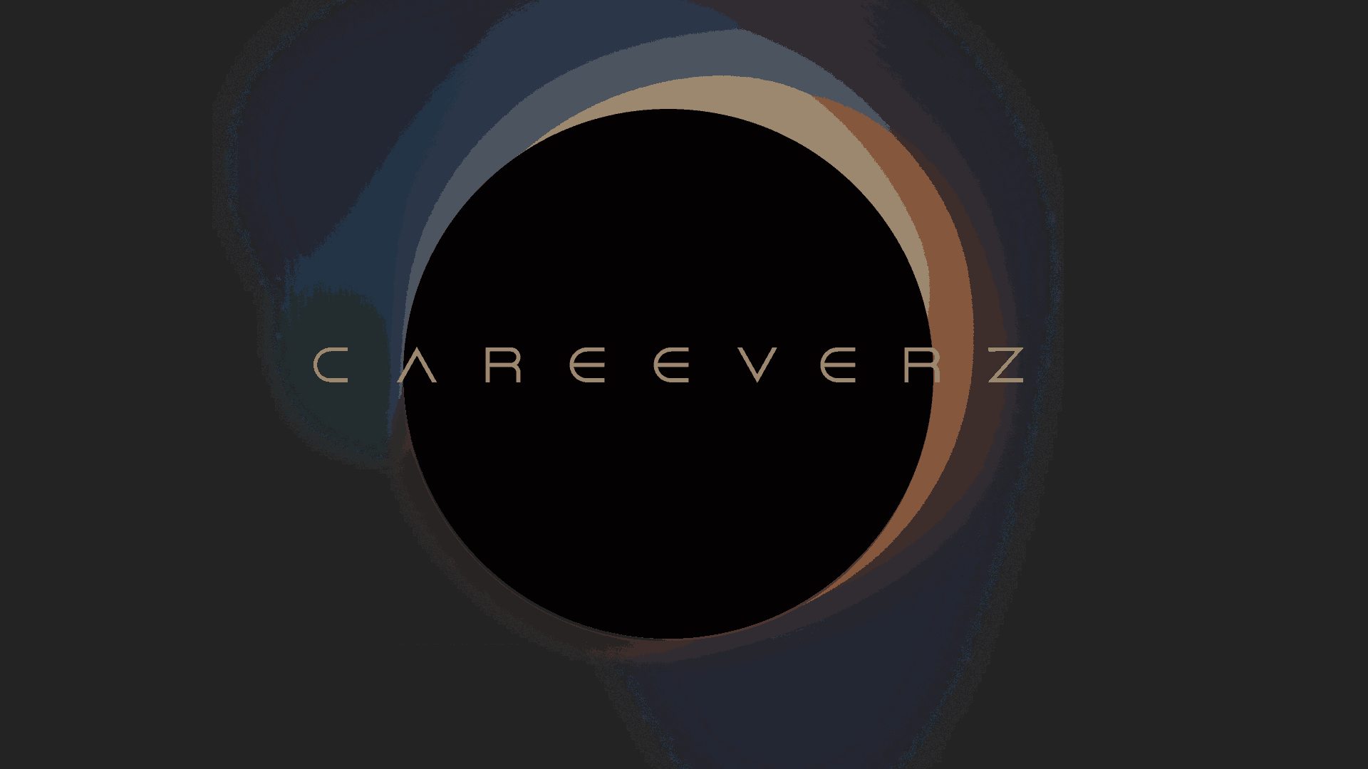
Yuck...
And in 64x64
Shit...
The lesson: the logo should be simpler...
ROUND 2
What if it were as simple as a circle?
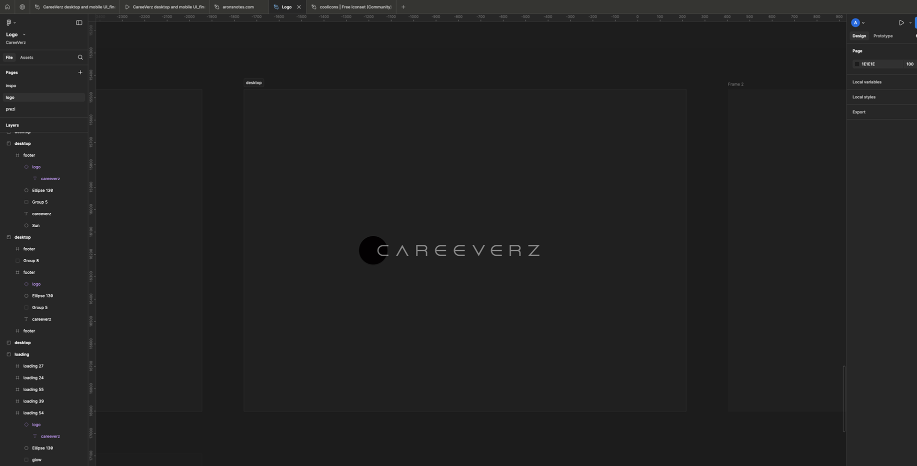
What if it were big?
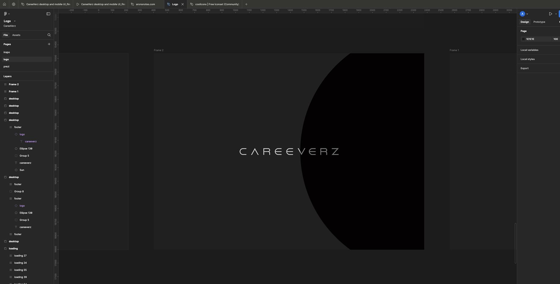
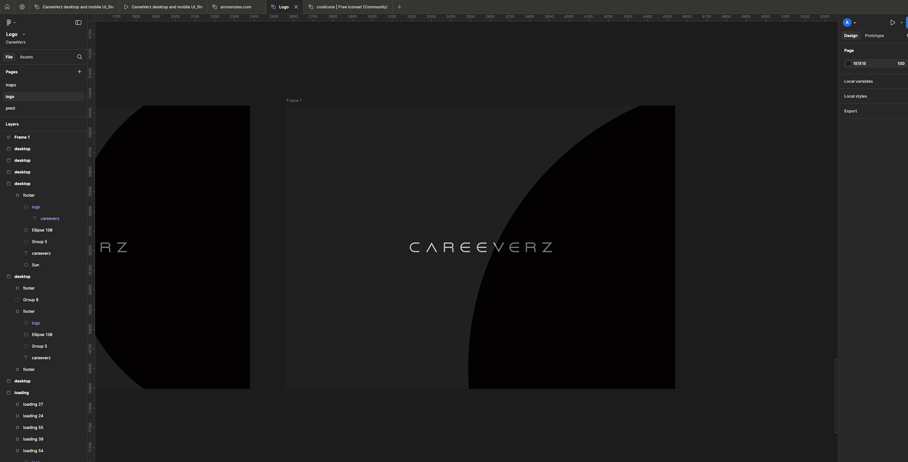
This is too simple...
But then God smiled upon me and sent me a sign
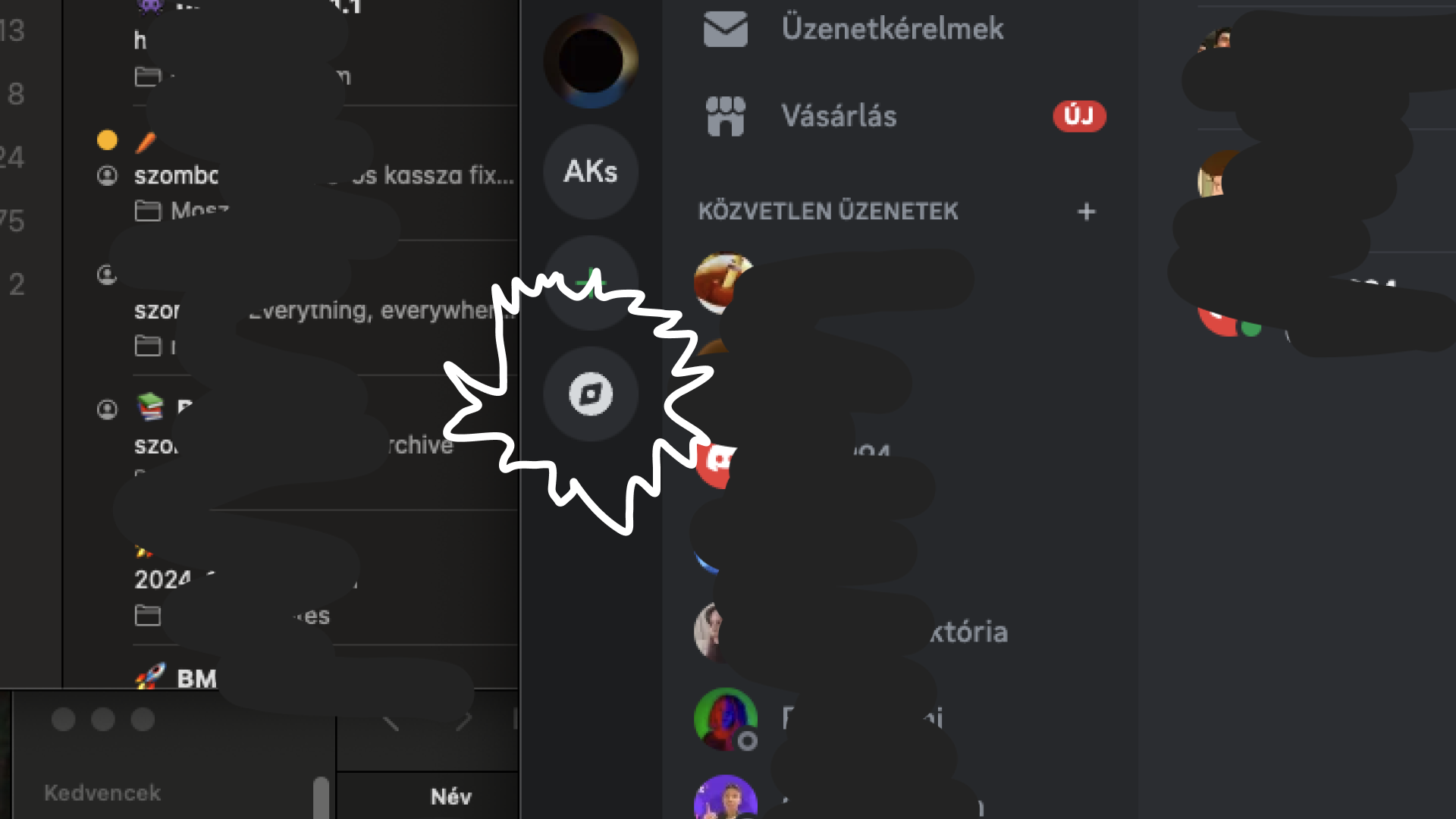
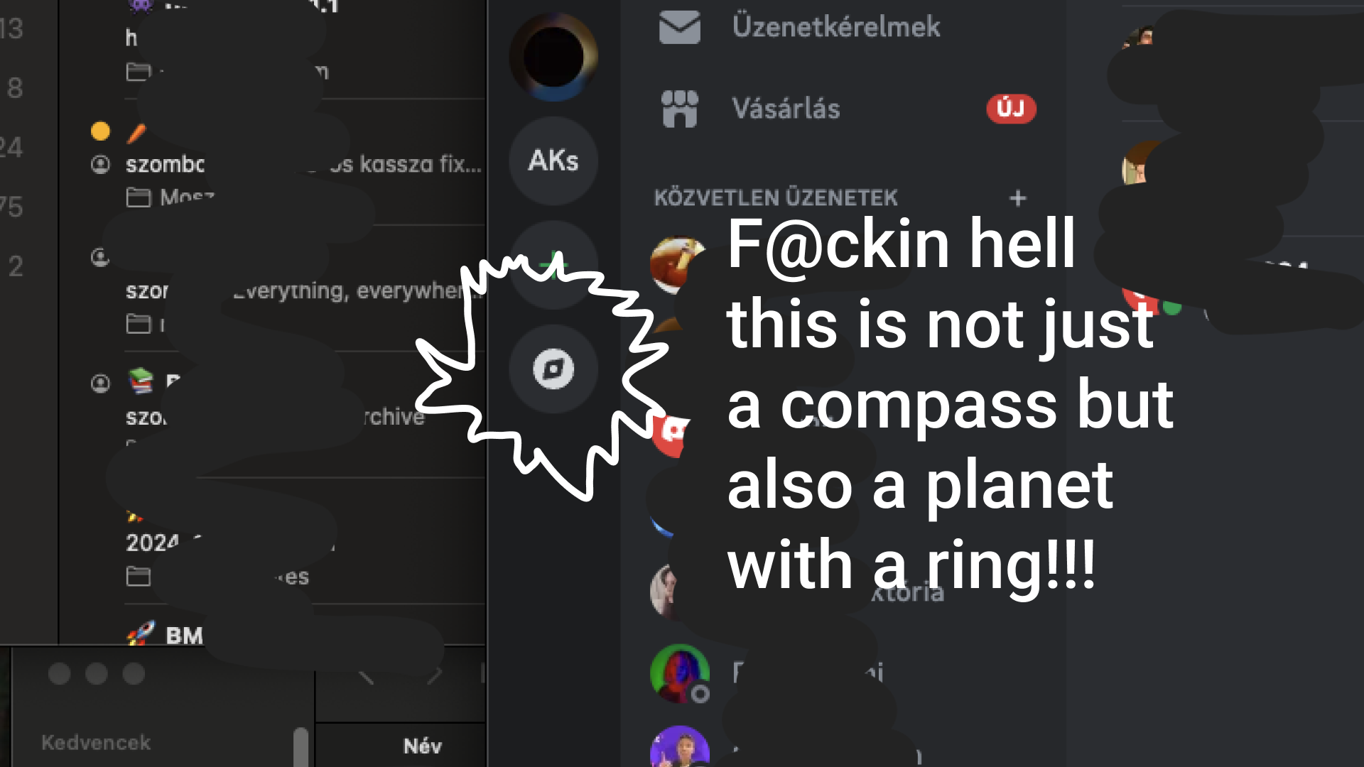
Back to work...
Started off with a rounded compass icon
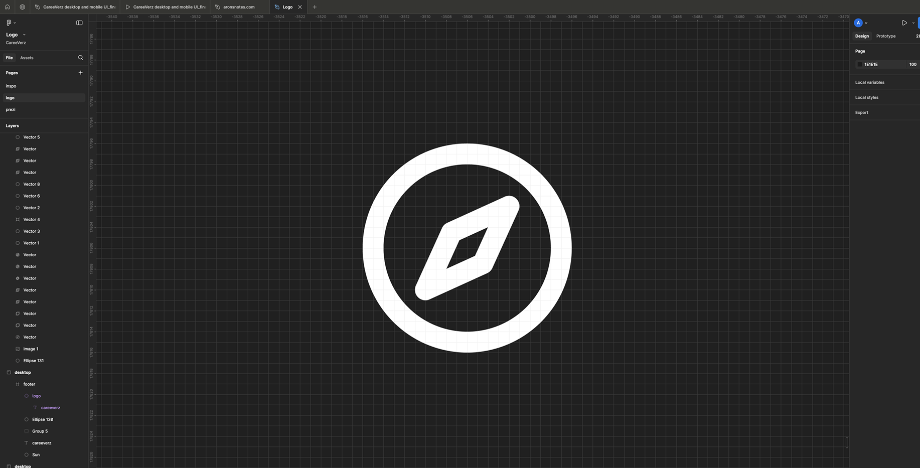
Get the basics right
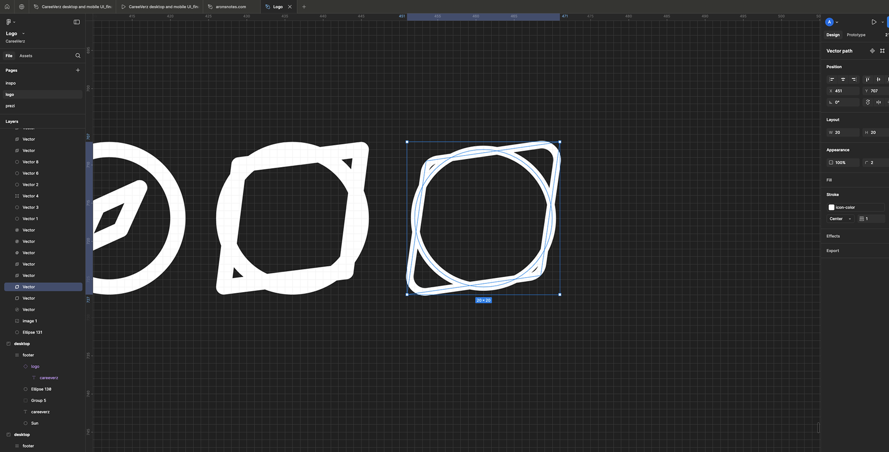
Work on the angles
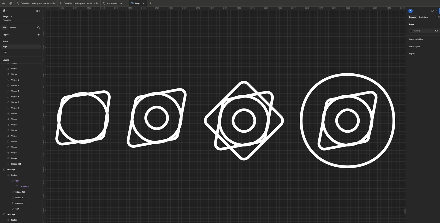
Give it filling
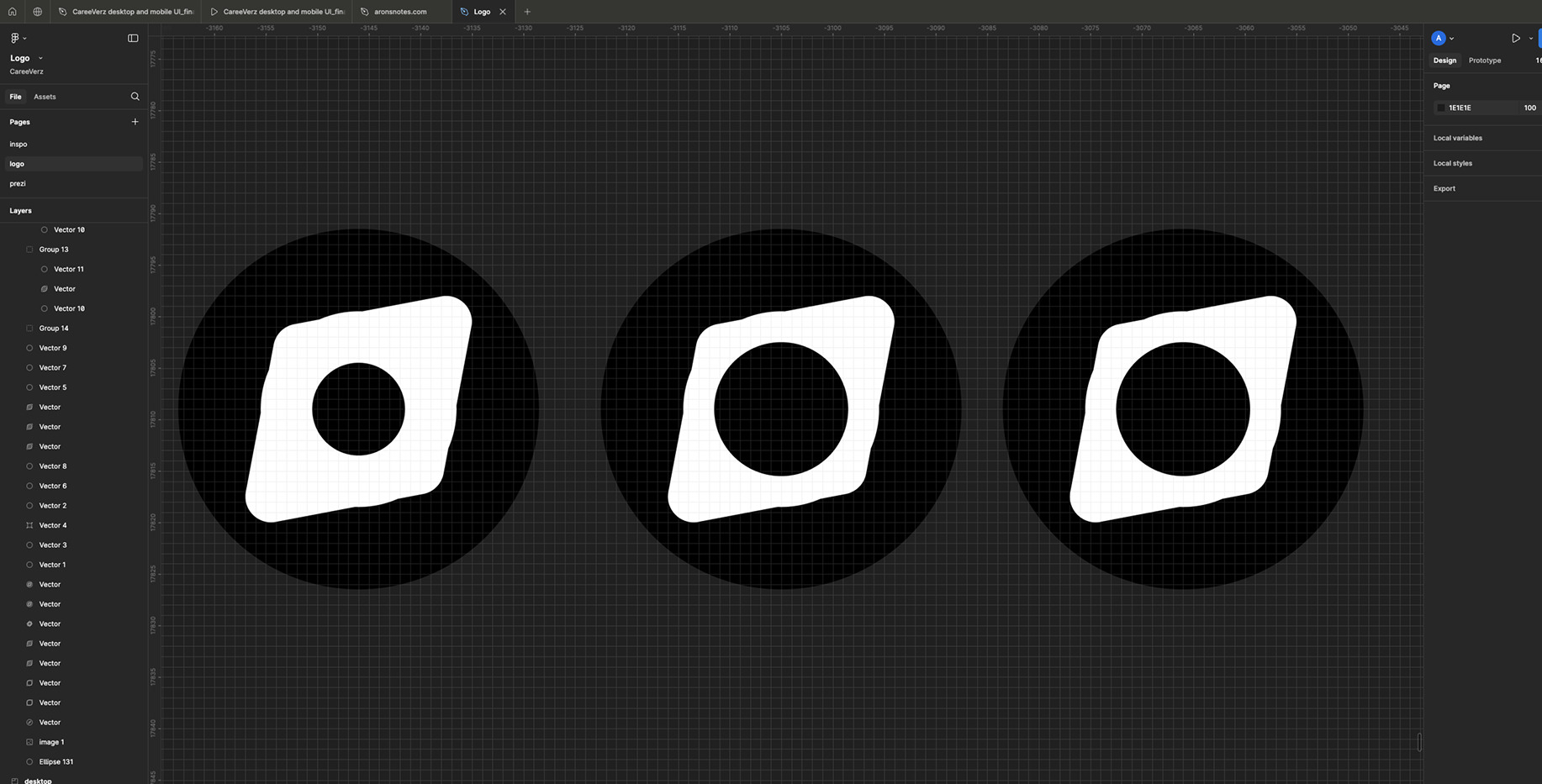
Until it's finally right
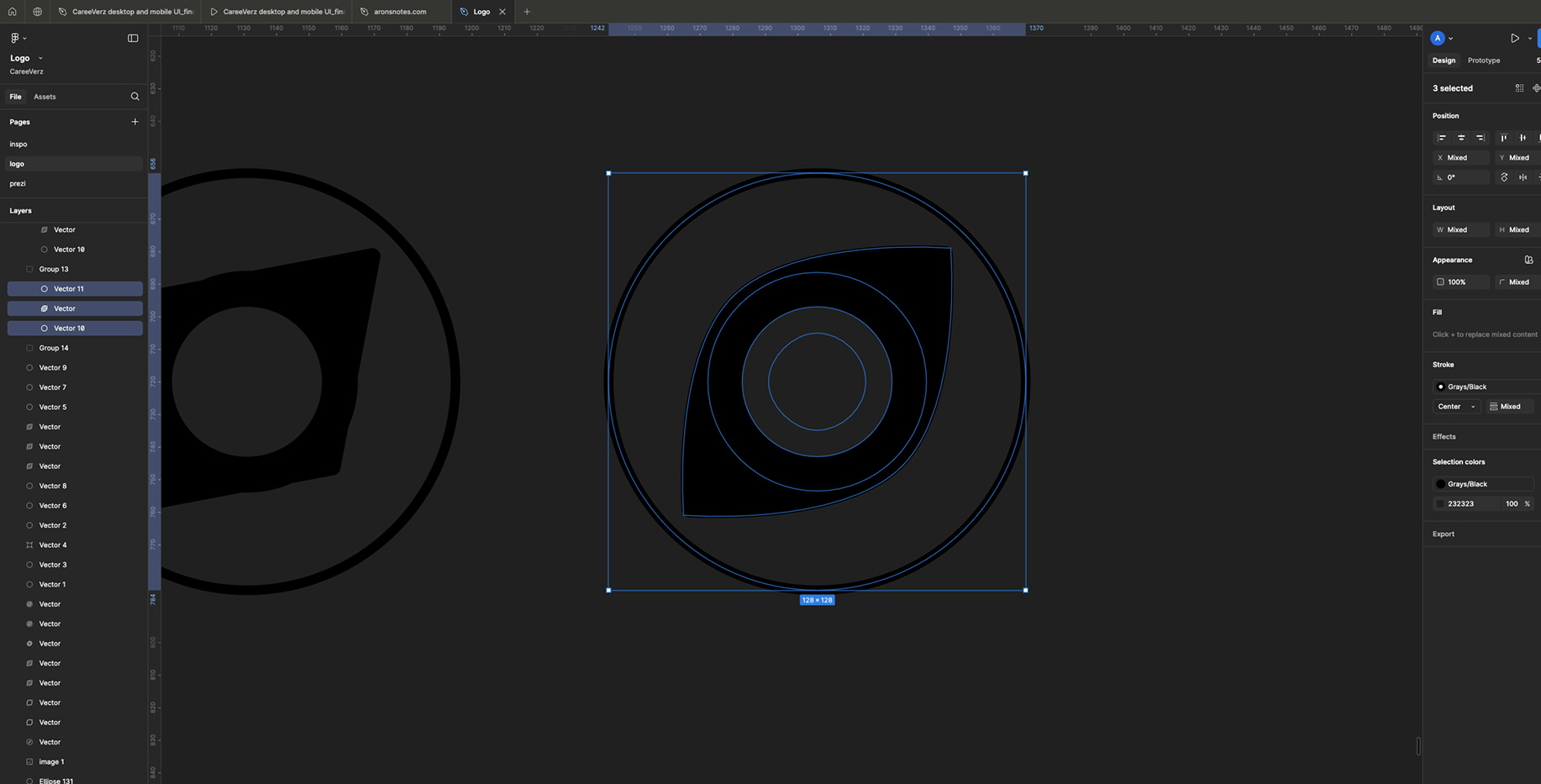
This is it...
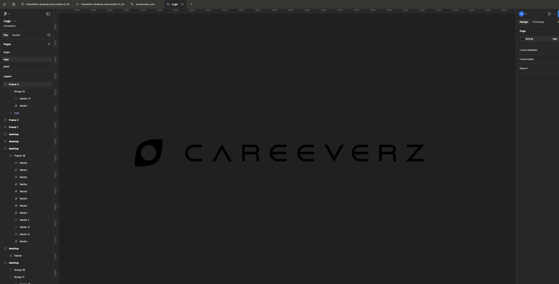
Some artwork