CareeVerz UI and brand identity v6_final
CareeVerz.com a step-by-step guide to the final design and design system
· by Aron Kovacs
summary
The UI Design process of CareeVerz.com. A dark, modern, and galactic career counseling AI web app. You will find below the jist of CareeVerz.com's design system and some screens on the final UI. This article covers the 6 months journey of designing each and every screen for CareeVerz.com a career counseling AI web app.
CareeVerze's mission is to become “a compass in the world of work".
UX requirements
Of course, everything starts with requirements. In this case, we are standing on the shoulders of giants. Our Team has already built the UX wireframes previously (see UX articles for more details), which were already defined at a pretty high level (see pic below).
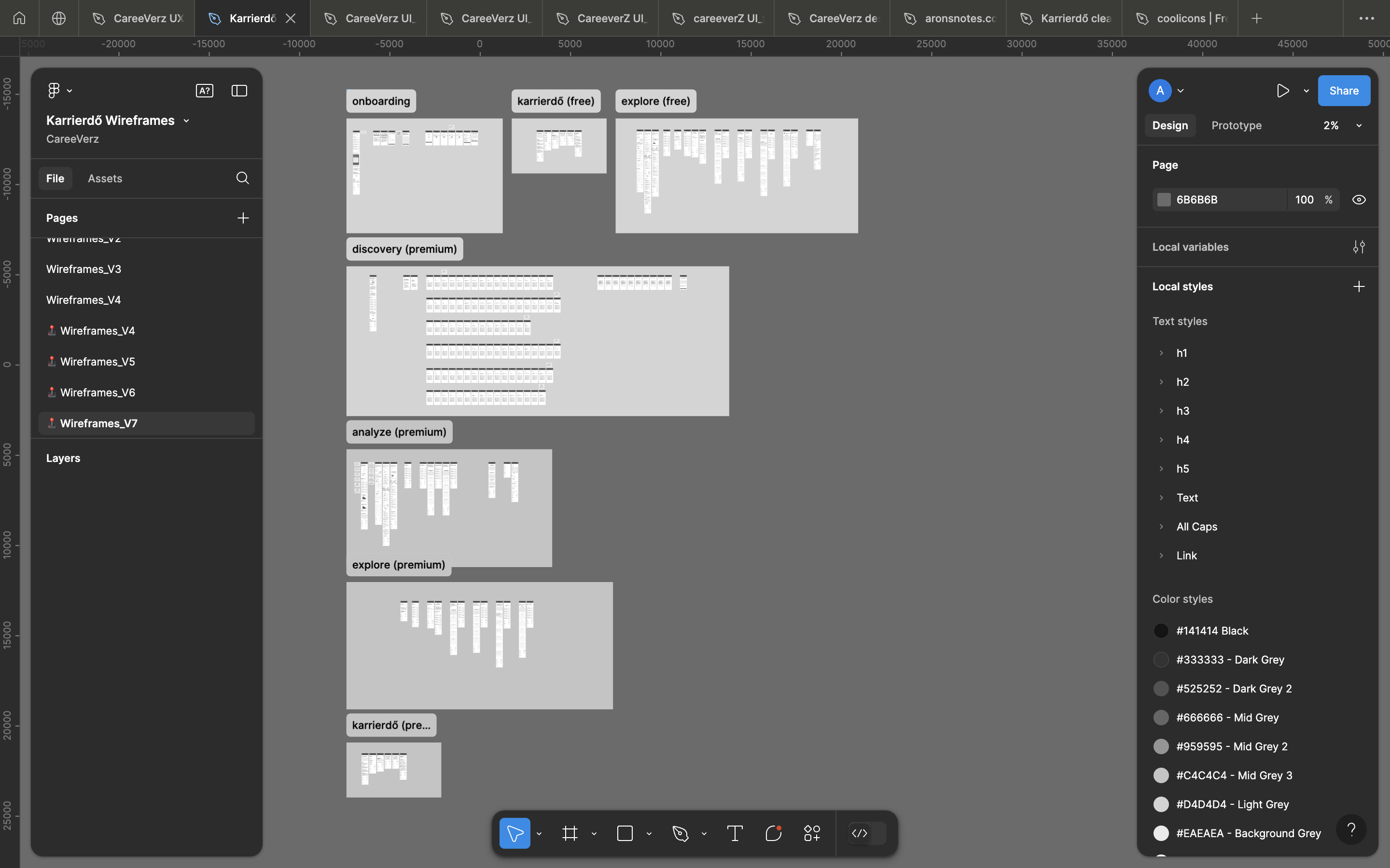
This high level of design might scare some designers away, but not me! I love constraints. Constraints enable creativity.
We also had a design system in place, which meant that with just a few clicks we could transform this beast into... well... a pretty beast.
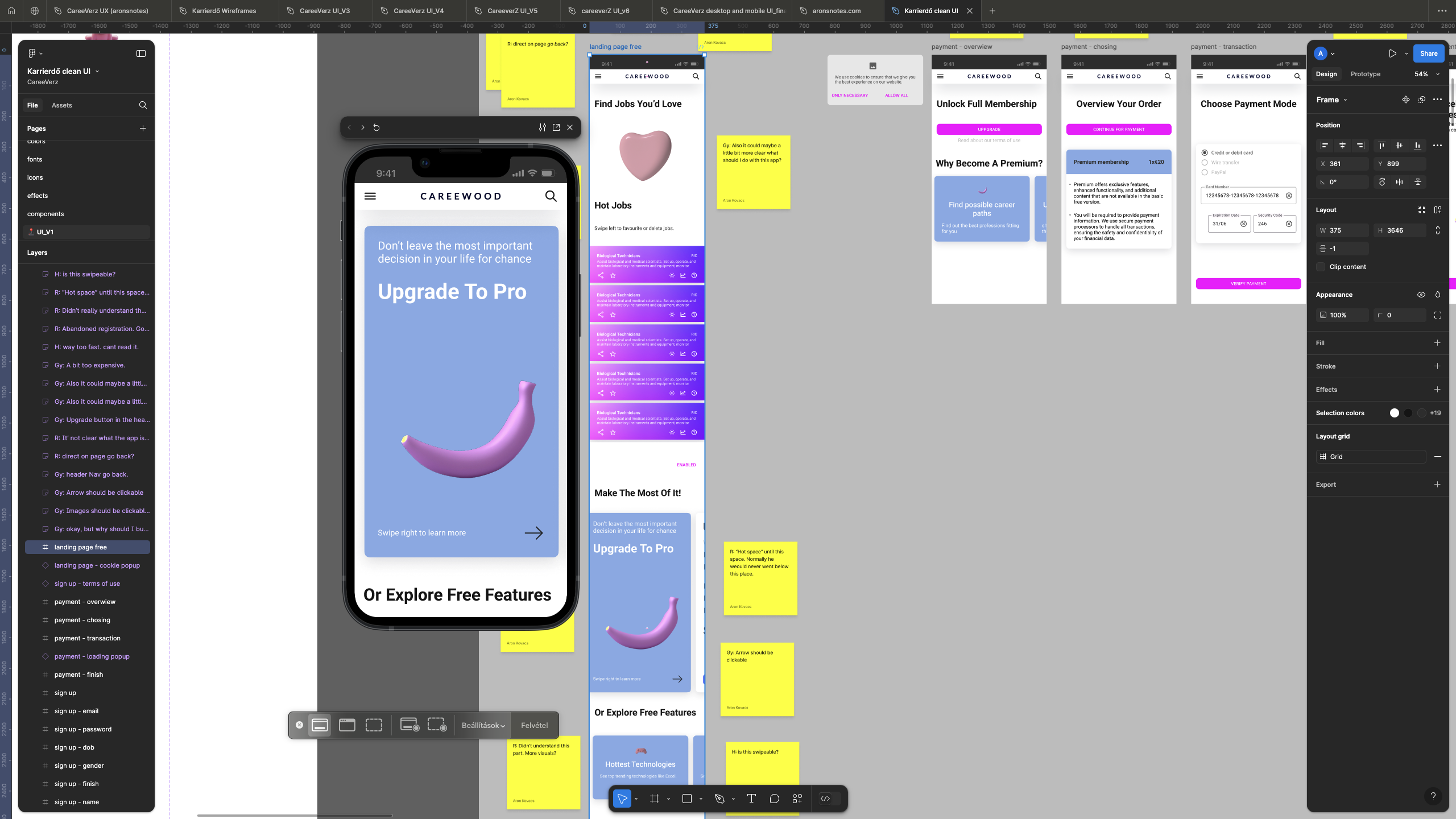
So this begs the question: is the work done?
Of course, we have the contemporary blue logo, 3D images,
and gradients!
No, not all! This only means we can test our hypothesis with a prototype that will not scare users away.
And since the testing was done, we gathered the necessary feedback from our users, which is good!
You should be as close to your users as possible.
In essence: the feedback from users highlighted that there are some key screens that take up most of the user's attention. These were the landing page, the careepoints pages, and the results page. Therefore the ux requirement was to make these pages engaging.
let there be moodboard
Before diving into any UI process the soul of the brand must be captured.
Btw if the design requirements are not given by the Client I strongly recommend that you involve them in the creation of the moodboard or the look and feel.
In our case, we were the Client, so the temptation for me, as the solo designer of the company, was huge to create this artifact by myself. But there is a slight problem with that. If the host doesn't have buy-in, it will start to produce antibodies...
So as a team, we gathered what was the most important for us in this effort.
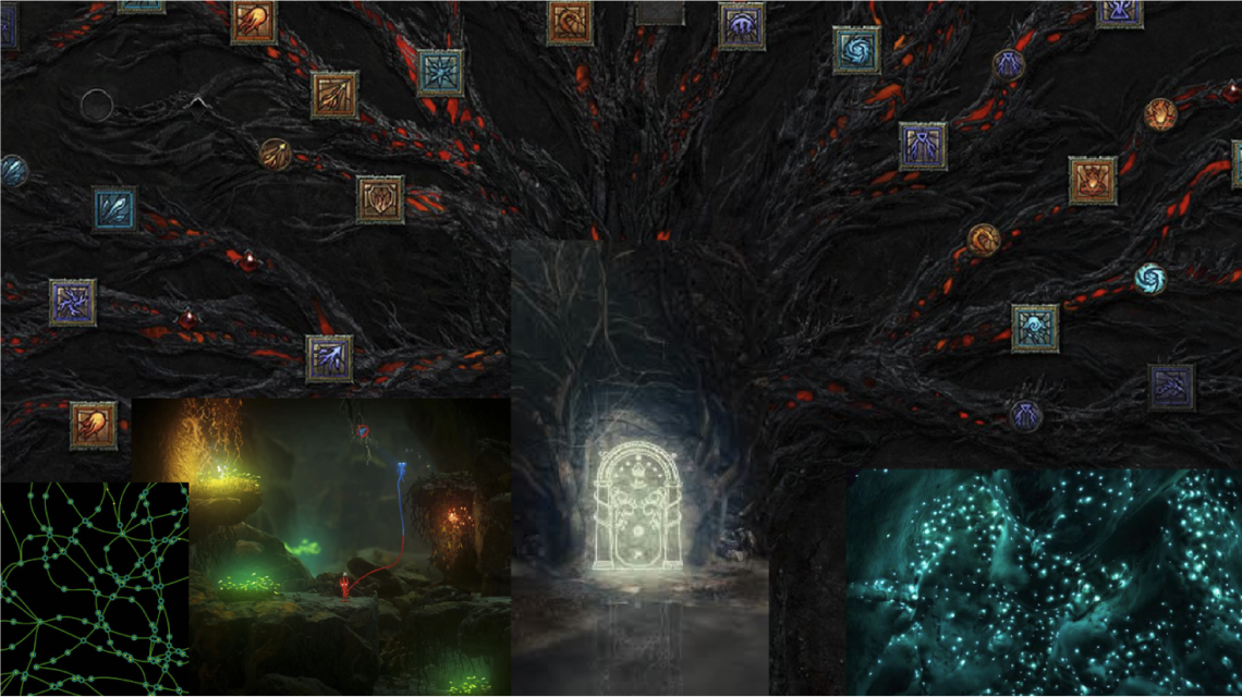
Lo and behold: our moodboard featuring the Diablo skill tree, the light from Unravel 2, the door of Moriah from LOTR, and some weird glowing underworld stuff from Skyrim's Blackreach. Of course, we can not forget about the microscopic funghi network underneath all.
design system
If the moodboard is the soul of the design, then the design system is the engine that powers it. It's a living thing evolving with the UI. So you must come back and keep iterate on it. Find below some of the key elements of our system.
logo
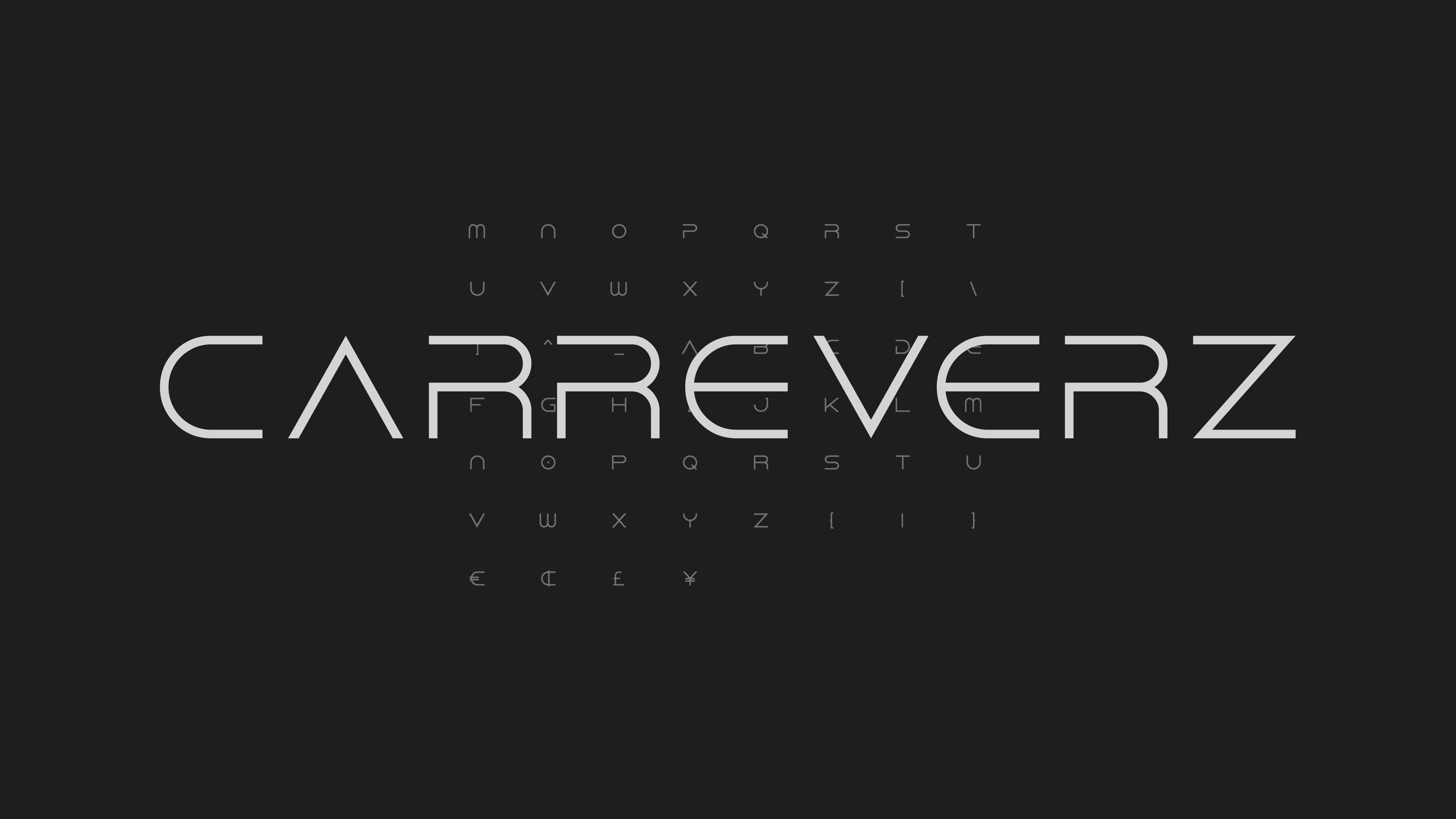
The font for our logo is 'Dune Rise' a Dune inspired font. It's a modern, curvy, and edgy font perfect for a sci-fi web-app. This font is only used in our logo and nowhere else.
font
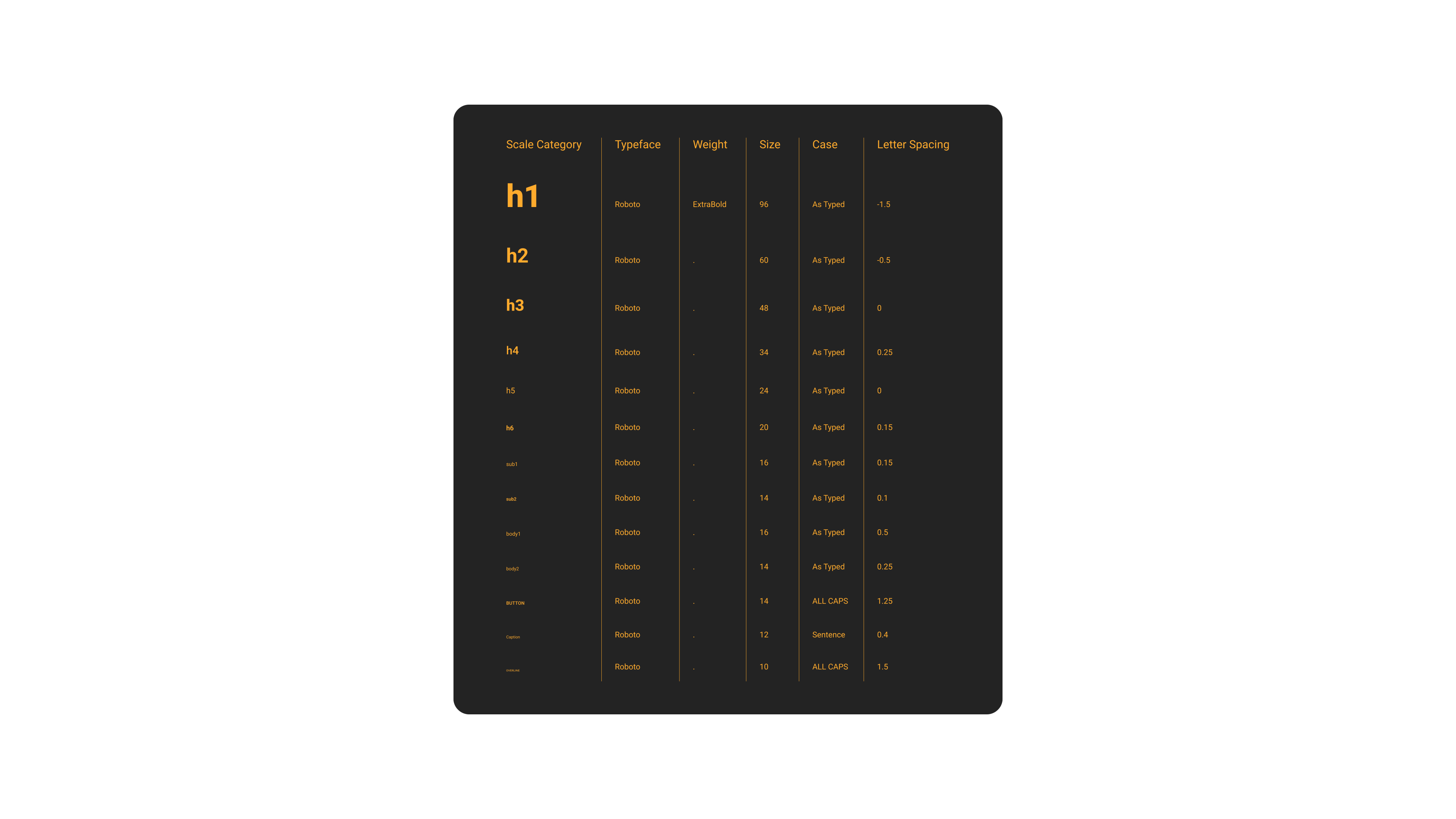
So our main font was Roboto. It's the real shit. But seriously, it's a very readable and modern typeface. No nonsense. Keep it simple.
scenery
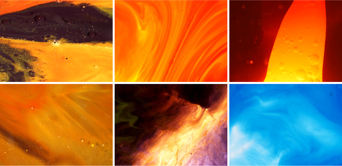
Just like the universe, our portal is in constant slow motion. That's why we picked the universe-like moving stuff. Shout out to Dan Cristian Pădureț for these beautiful videos!
colors
It's only natural that our color selection was inspired by the scenery. The primary colors are black and white just like the sky at night. The secondary colors are oranges just like the glowing sun (and the light in Unravel 2). Finally, the tertiary colors are vivid blueish-es as the northern lights (and the glowing stuff in Blackreach).

icons
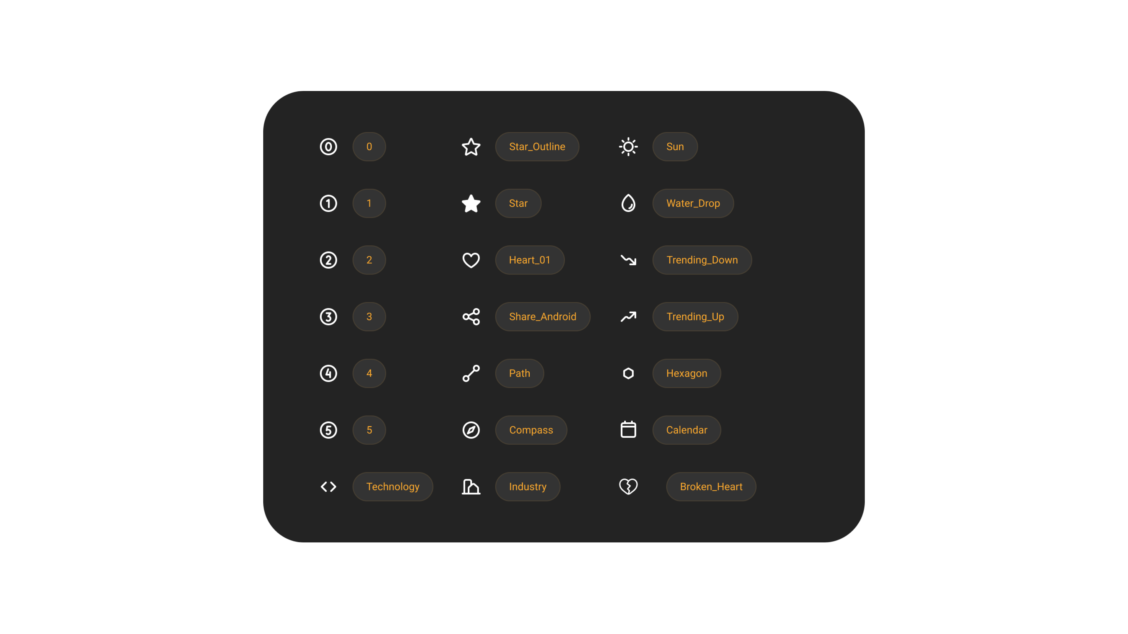
I'm just gonna say it: curvy is sexy. And these are some extra curvy icons. Shout out to Coolicons for this cool icon set!
symbols
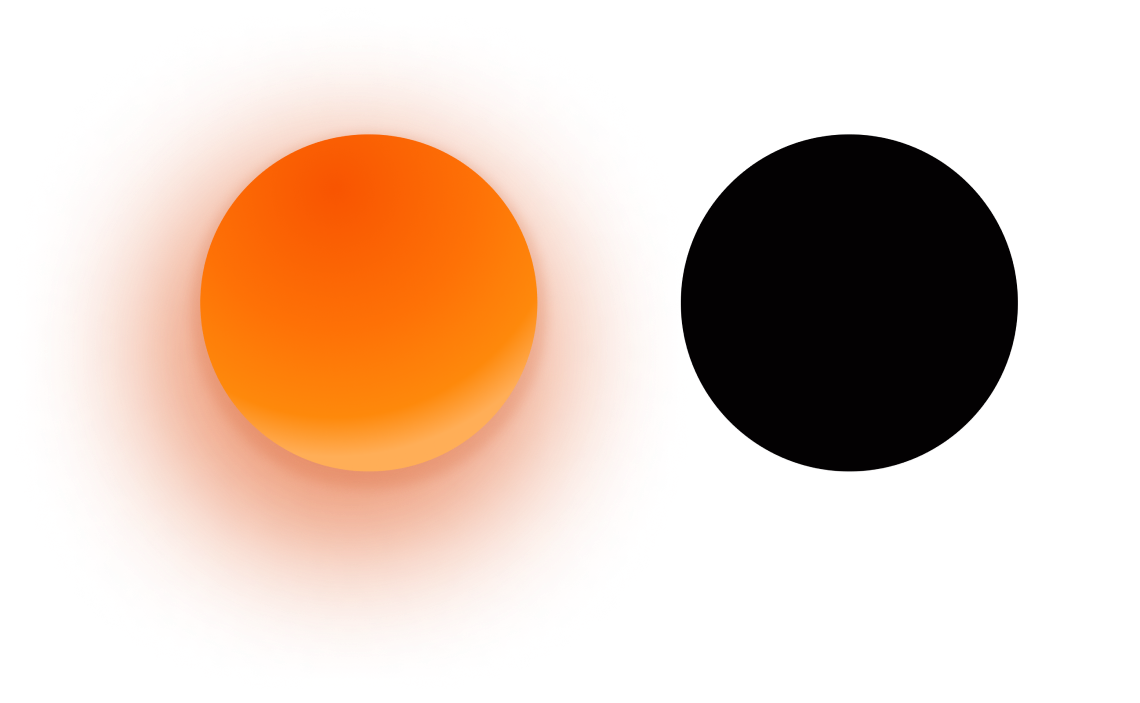
Once upon a time, there were two siblings: the Sun and the Black Hole.
“Did you know that every universe has a black hole at their center? No? Well you learned some shit today.” - Aron
The sun resembles the light that must be followed. It shines on the wide road on the way to the mighty land of premium.
The black hole symbolizes the vast and mystic nature of the universe. You might as well follow the narrow free road through the endless realms of CareeVerz.
components
In some cases, we were very opinionated.
Just like planets CareePoints also have life states. These are: emerging, expanding, stable, and shrinking. Our advice is to try to go for the first three and try to avoid shrinking careers. Of course, it's not a must, if you really love something you should do it. But almost always shrinking careers means shrinking opportunities, and expanding competition leading to a zero-sum game. It's just better to go for growth baby!

Another key piece is the CareeCard, which shows users at-a-glance a CareePoint.

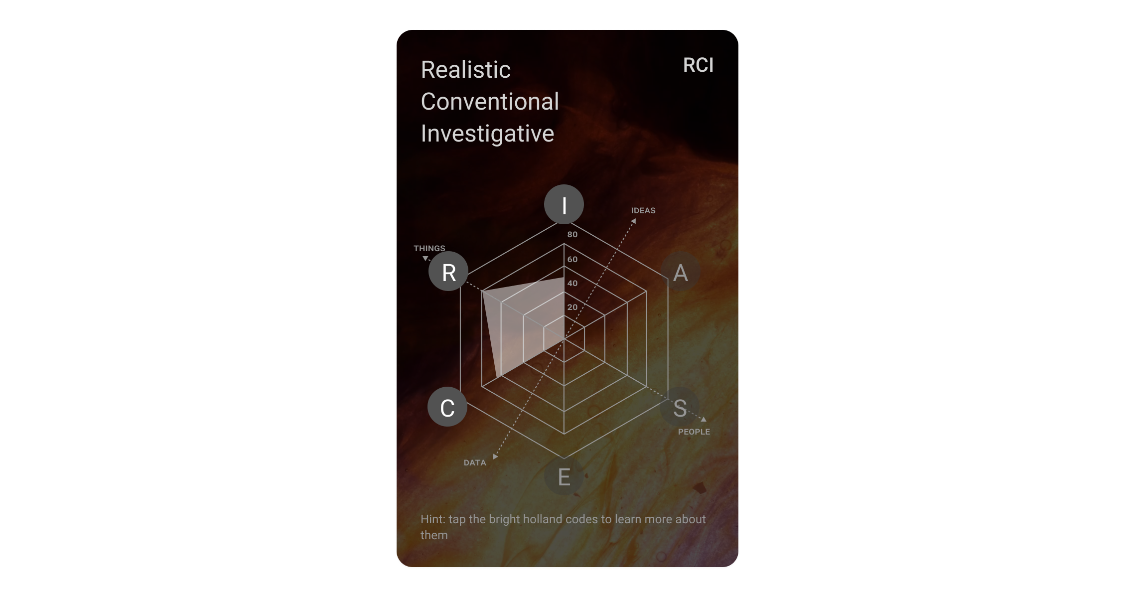
The result card shows the user her personality or the CareePoint's personality.
key screens
Enough of the talk already. SHOW ME WHAT YOU GOT!
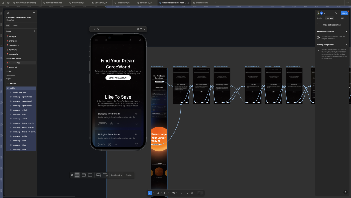
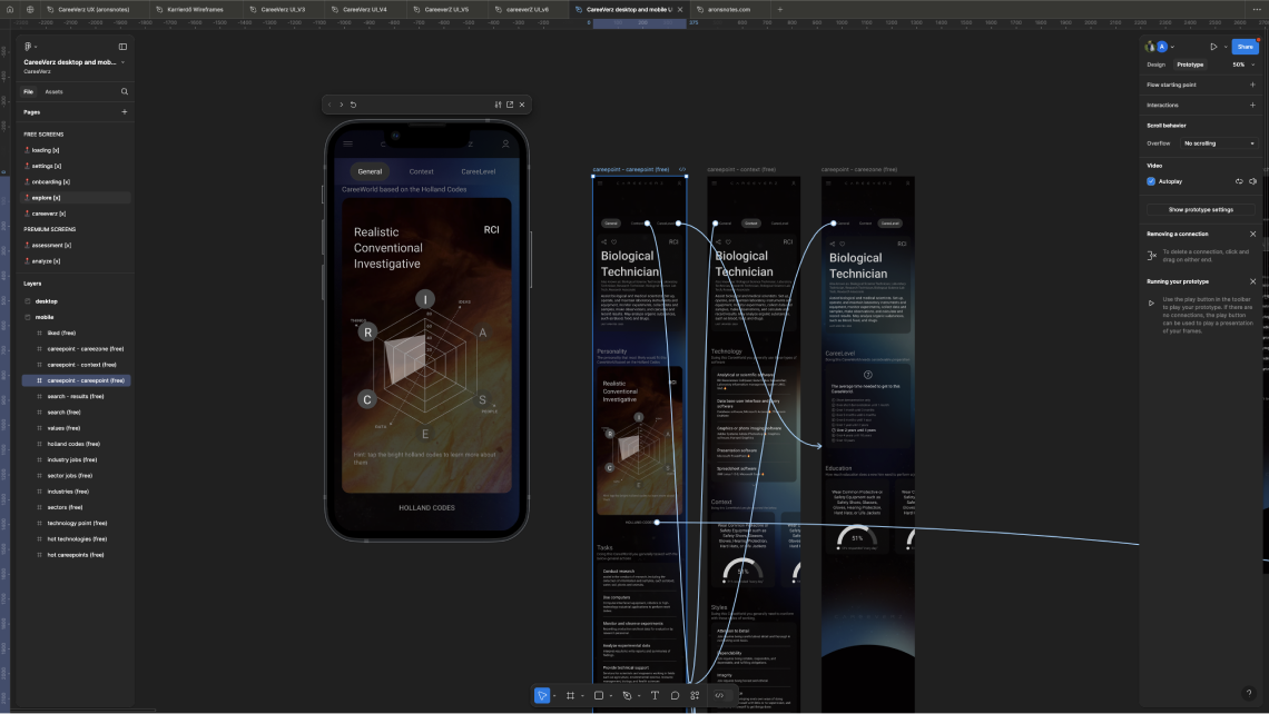
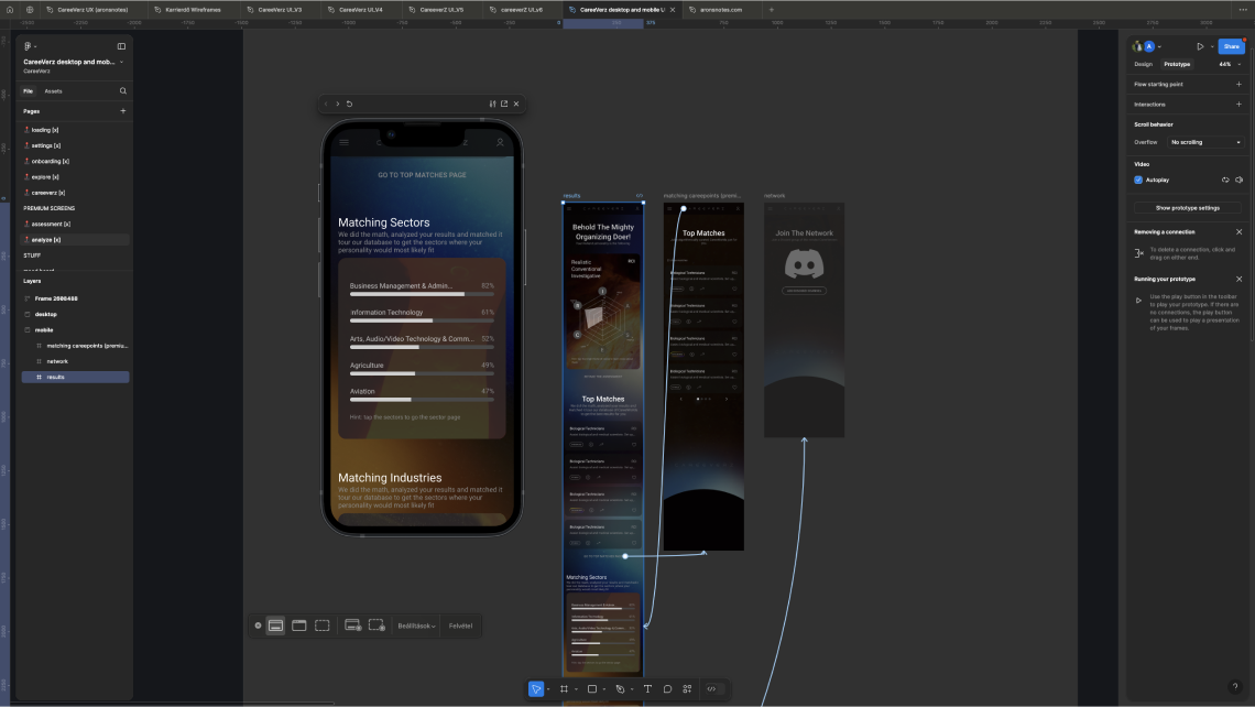
Okay! Here you go. The aforementioned three screens got the most design.
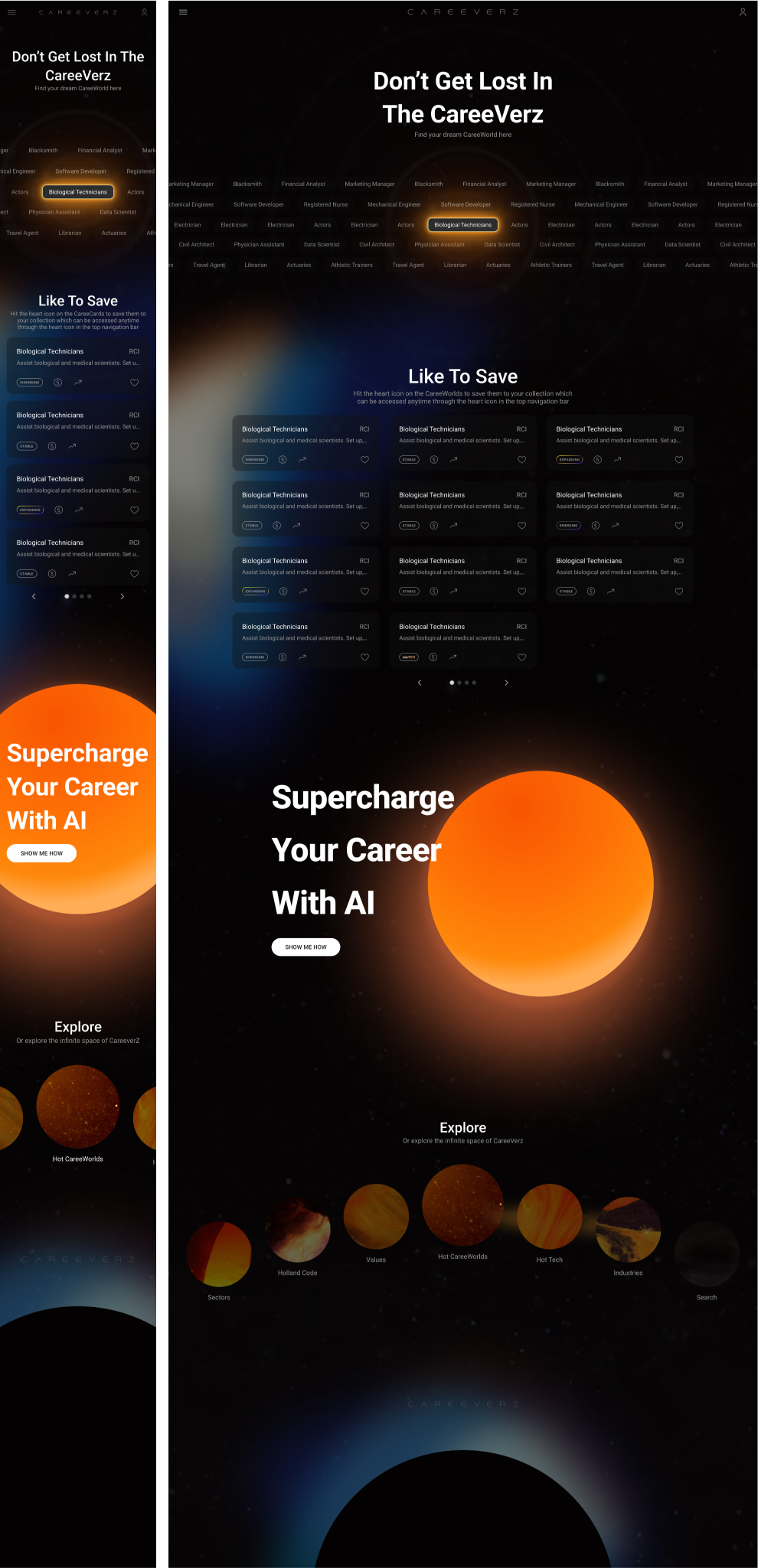
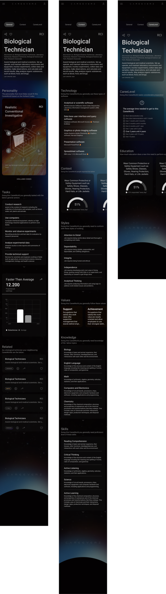
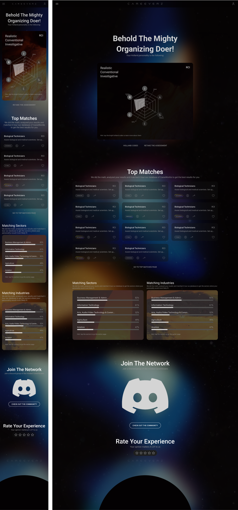
and other notable screens